A useful room begins with observation. Take what serves you, adapt it to your space, and leave room for the home to change.
The concept palette
Digital concept colors, not paint matches. Compare real samples in your own room.
Keep the useful piece at the center
A living room rarely arrives as a complete set. A coffee table from a previous apartment may sit beside a newer bookcase and a chair you inherited. Before replacing a piece because its wood looks different, ask whether the room works for your daily routine. This guide offers a way to compare the finishes you already have; it does not promise a universally correct combination.
Name what you are keeping
Choose the wood piece that will stay: perhaps the largest cabinet, the table you use every evening, or a chair with personal meaning. Describe its appearance in your own words: pale and muted, golden, reddish, or dark brown. That description is a comparison tool, not an identification of the wood species. Look at the piece in the room itself. A retailer image or a photograph on your phone is useful for reference, but compare a real sample before buying a finish that needs to work beside it. Include the existing floor in the comparison if it occupies a large part of the view.
Try a difference you can actually see
Instead of searching for an almost identical finish, compare one option that is clearly different. A pale table and a dark cabinet are one possible direction; two middle tones may be another. Choose the contrast you enjoy rather than treating either option as a rule. For a no-purchase trial, move a small wood object you already own near the main piece. Compare the arrangement from your usual seat and the room entrance. Keep a note about what feels distracting before adding another variable.
Give the two finishes a shared companion
Use an existing textile, framed print, or ceramic object to connect the arrangement. For example, a cream textile and a muted blue accent can be repeated near two different wood finishes. Repetition is a styling option; there is no required number of matching objects. Try removing an accent as well as adding one. If the wood pieces already have detailed shapes or strong grain, a quieter surrounding surface may suit your preference better than another patterned item.
Test shape and location as well as color
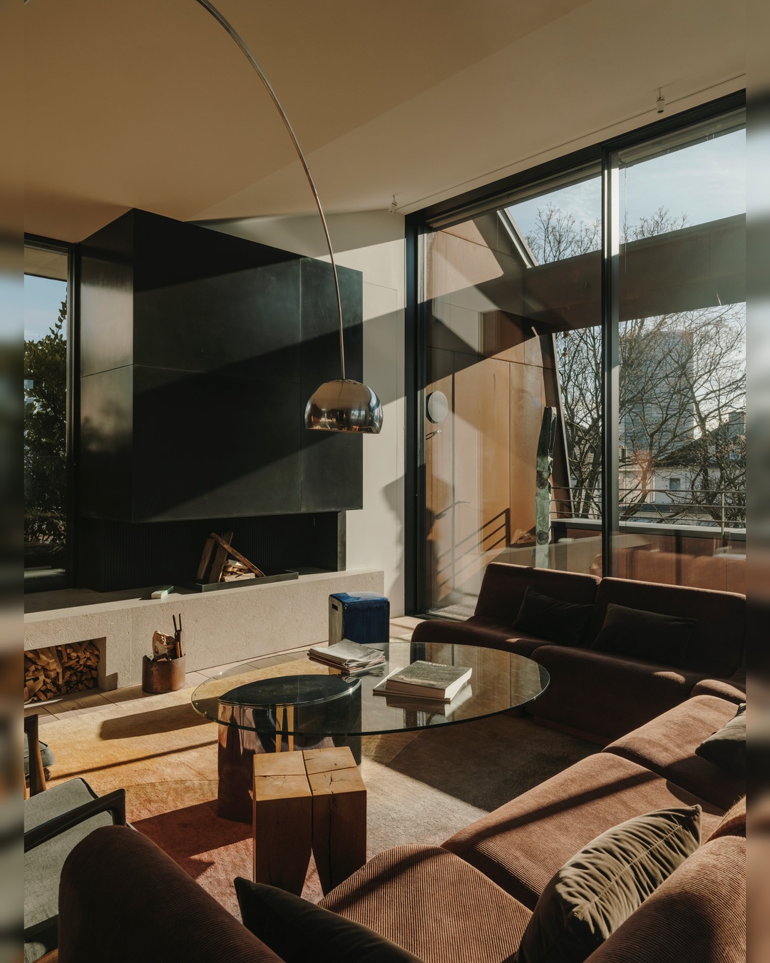
A finish can appear different when you move the item beside another material. Try a new location if it does not interfere with everyday movement, doors, or the intended use of the furniture. A curved chair, rectangular cabinet, and soft textile introduce differences in shape as well as color. The goal is to evaluate the full arrangement, not to make every wood item pass a color test in isolation. Avoid purchasing a matching piece to solve a problem that a simpler rearrangement could address.
Write a buying brief only if a gap remains
If the room still needs a side table, record its intended job, dimensions, and the finishes it must sit near. Check the exact product's materials, care instructions, and return terms independently. Keep those practical requirements separate from the appearance you prefer. A completed brief might say: a surface for one mug and a book, a measured footprint beside the chair, and a visibly lighter finish than the cabinet. It gives you a reason to choose a piece without requiring the room to become a matching set.
Sources & method
This is original editorial planning or inspiration, not a hands-on product test. Styling choices are editorial suggestions. Product-specific instructions and your own measurements take priority. Revision 2; human review pending. These are original styling suggestions. No model-specific product specifications or testing claims are made. Product recommendations require a separate evidence review.